RE-COLOURING MORRIS WITH BEN PENTREATH
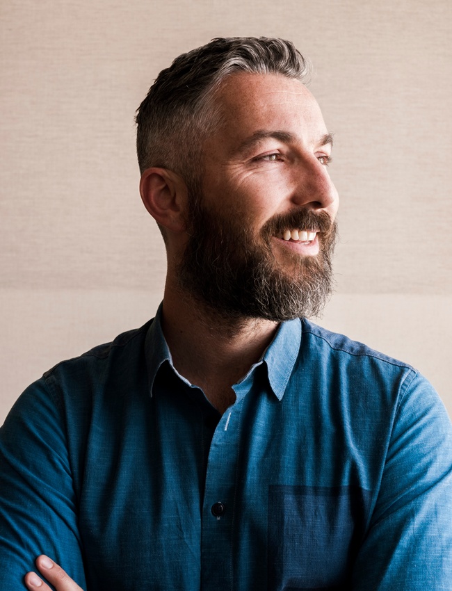
Interior architect Ben Pentreath tells House & Garden deputy editor David Nicholls why he wanted to introduce ‘60s pop colours into Victorian patterns...
Like any creative industry, interior design and decoration is one that is in thrall to the new. Sometimes, however, it is simply a fresh perspective on something that already exists that proves the most exciting. Such is the case with The Queen Square Collection, a collaboration between Morris & Co. and Ben Pentreath, one of Britain's leading architectural and interior designers.
Earlier this year, Ben, who has spent his career balancing his love of classical architecture with his looser and more maverick approach to interior design, was asked to offer his own interpretation of William Morris’s wallpaper and fabric designs. ‘For a long time, I had been over-dyeing Morris & Co. patterns for our decoration projects where I wanted to use these beautiful designs but with a little more intensity than the current colourways offered,’ he explains. ‘ So the opportunity was one that was too good to miss.’ Recolour rather than re-inventing became the key to the collaboration.
‘One of the things which was essential for me was not to play around with Morris’s actual patterns or designs in any way,’ he says. ‘I’ve admired and used Morris for so many years precisely because he was such a master of pattern and - above all – repeat. So I wanted to stay completely true to the original designs.’
In the 1960s and 70s Sanderson did some experimenting of their own with recolouring Morris’s designs, and this provided a huge amount of inspiration for Ben. Marigold in Olive/Pink, Chrysanthemum in Summer and Willow Bough in Bitter Chocolate have an energetic Sixties feel, for example. ‘I think the mood of that era feels good for now,’ Ben says. 'There’s maybe a sense of innocence and happiness which is appealing. It was also an era in tune with many of our own concerns in the 21st century: the first nascent realisation of an environmental movement, and the sense of our natural world under threat; a world in which things don’t always feel safe and settled. And in these moments, I think a sense of nostalgia and happiness and comfort at home becomes all the more important.’
What the collection shows to great effect is the transformative power of colour. And not just how colour can transform the look of a fabric or wallpaper, but also the way it makes us feel. ‘If we take the original colourway of Willow Bough,’ Ben explains, 'it evokes a particular mood of the mid-Victorian country house – calm, restful, wonderful, but not for everywhere. Bringing the same pattern into a range with turquoises, happy sky blue, warm pink, hot red or bitter chocolate completely changes the mood and energy to rich, to cosy, to dramatic.’ He’s not wrong.
‘I hope that the re-colourings make possible a much richer spectrum of use,’ he continues. ‘They do for me. What’s most exciting now is that we are currently at work on a new collection – which is looking at re-introducing some wonderful new patterns from the archive but are once again using colour to evoke a completely new mood and direction. But that’s all I can say for now!’
posted on 09 Sep 2021 by David Nicholls in Interviews