Ben Pentreath’s five Tips For Summery Schemes

With sought-after interior architect and designer, Ben Pentreath, we’re diving into 5 ways to achieve a crafted, summery look in your home.
Ben has put together an edit of fresh spring and summertime paint hues with jubilant floral designs, combining our fabulous paint with wallpaper and fabric designs from his latest collaboration collection with Morris & Co., Cornubia.
EMBRACE A SPRING PAINT PALETTE
There’s no better way to transform your space into a springtime retreat than with a good lick of paint. Morris & Co. Paint offers 40 timeless hues, with colours taken from archive designs. Tones like Weld Yellow and Kelmscott Water, chosen by Ben, introduce sunny yellows and rippling blues into rooms humming with colour.
BRIGHTS ARE RIGHT
What colours do you think of when you think of Spring or Summer? We bet they’re bright. Spring Thicket Dawn is a favourite peachy tone of Ben’s, loved for its soothing, upbeat hue. The tone itself is taken from 1894 design Spring Thicket, and we think it’s the colour of the spring’s dawn sun rays filtered through bushes and branches.
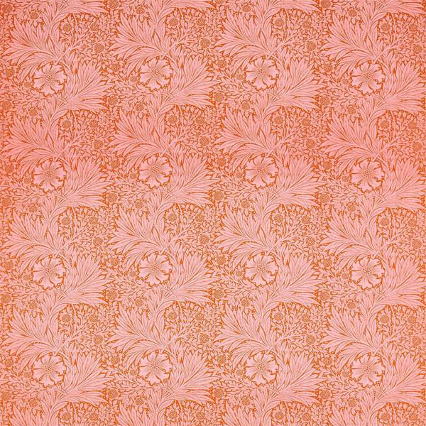
MARIGOLD IS THE DESIGN FOR ALL SEASONS
Ben simply cannot put down 1875 design, Marigold. Having reinvented this iconic design in both of his collections for Morris & Co., it has become an enduring source of inspiration. The marigold flower itself, growing in a vast array of flowers, is cherished for the intense, often fiery, brightness of its flowerheads.
Ben thinks his Marigold fabric in Orange/Pink sits harmoniously with a soothingly neutral paint like Citrus Stone. Read more about Marigold, the design for all seasons, here.
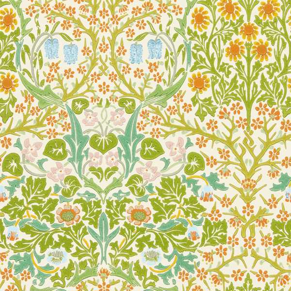
BLACKTHORN MADE BRIGHT
Known to folklore as ‘Witch’s Fingers’ and to fairy tales as the entrapping tree of Sleeping Beauty, Blackthorn’s first iteration by J.H. Dearle in 1892 responds explicitly to this brooding darkness. But what is great design, if not a thing to be re-invented? Ben’s Blackthorn has turned to face the summer, with lime greens, citric yellows and ever-so buoyant pops of blues.
A cooler neutral paint tone would really underline this Blackthorn’s summery flavour. Ben suggests Leafy Arbour, whose cooler green responds well to Blackthorn’s vibrancy.
THE SWEETEST PAINT
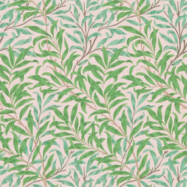
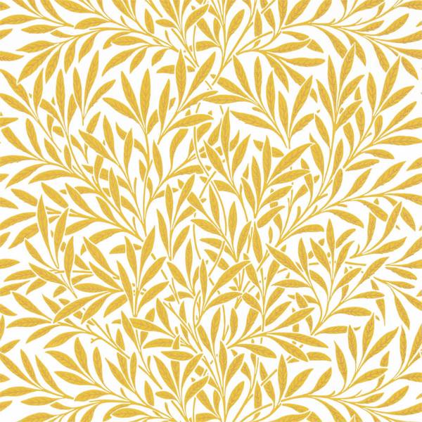
Pinks, glorious pinks! Definitely the sweetest colour in our Paint range, Sweet Briar is a rose’s kiss. Taken from the tones used in Trellis, William Morris’s early 1864 design, Sweet Briar elevates rooms with its charming, playful feeling. Ben suggests using Sweet Briar to complement his version of Willow Boughs wallpaper, pairing seamlessly with the kissed pinkish background.
SHOP PAINT


SHOP THE LOOK
posted on 22 Aug 2022 in Interiors